
I know you’ve all been waiting for the results of my Highly Psyentific(TM) apolitical election week poll. Without further ado, some impressive results from a sample of my 334 followers!

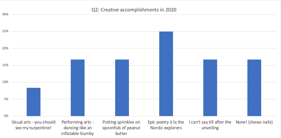
How about this one? What have been your creative outlets during 2020? If you read this blog, you know I’ve been cooking and eating. Sooooo creative, and also caloric.
Easy stats lesson
Lemme point out something you can easily check when you see tables like this in a newspaper or magazine. Have a look at the scale.
On the left side of each graph, you see the percentages: Q1 goes to 45%, while Q2 goes only to 30%. So two bars, like “Epic poetry” (25%) and “Going to the fridge” (38%) look like roughly the same percentage of the population surveyed, when they’re not. Here’s how SurveyMonkey presented the data to me. Note the scale is the same – 100% – in each case, so in this case the relative bar size is trustworthy.

How annoying are infographics?
Bad infographics, at least, are supremely annoying. The graphic itself often takes center stage. There are loads of bad infographics examples! An interesting visual representation and a bunch of numbers sometimes just don’t go hand in hand.
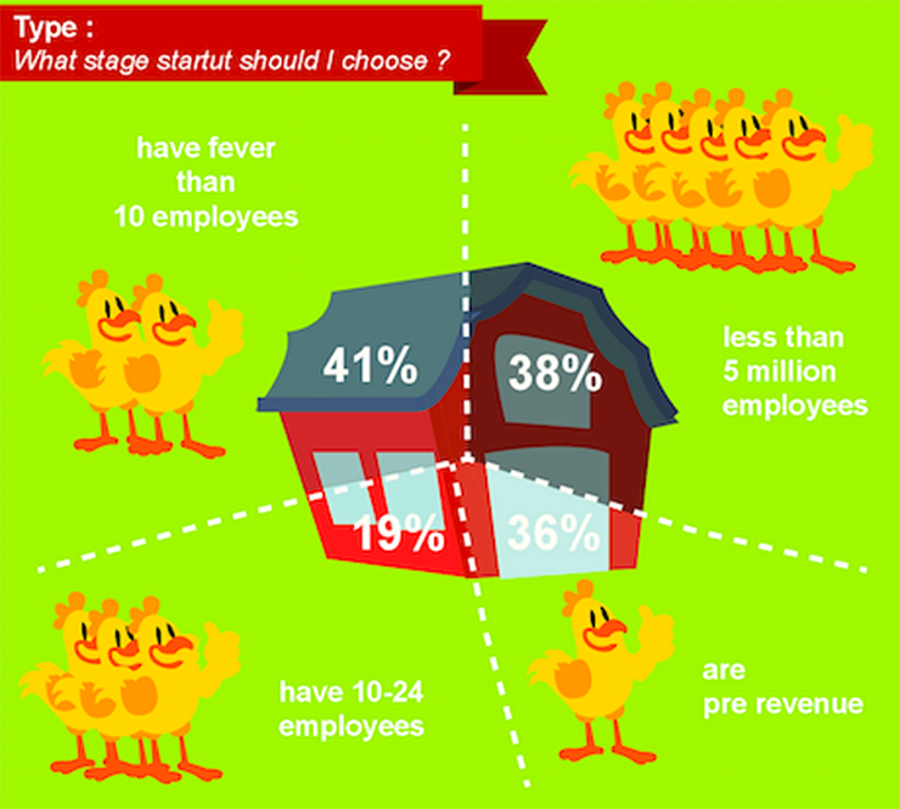
This one, for example, is riddled with problems. It’s not to scale, to start: the “slice” representing 36% is smaller than the “slice” representing 19%. The categories have an illogical overlap – all companies with fever [sic] than 10 employees AND those with 10-24 employees would also have less [sic] than 5 million; the pre-revenue slice just makes no sense at all. And, there are typos, and the colors are garish and bordering on offensive. I promise no more like this in the rest of the post.
So let’s get back to our apolitical poll!
What’s an n?
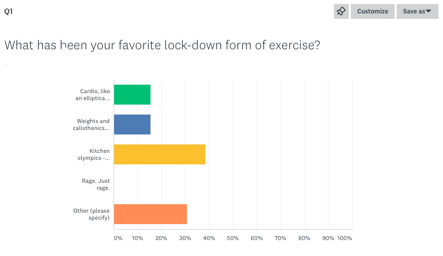
Here are some more characteristics of this sample of my 334 followers. This time the scale is set right, so the relative heights are visually comparable. Anything else you might want to know here?

I keep saying “sample of my 334 followers” – but how many people actually responded? Half? 10%? All of them? What’s the actual sample, and how were they selected? Did I…
- Send out the poll on the blog and hope for the best?
- Pick the friends most likely to fill it out, or who had the most interesting likely responses, and send it to them?
- Select a group of thirteen at random and then write them an email, begging them to fill it out?
- Make up the whole thing?
The answer is, I sent out the poll on my blog and hoped for the best. And I got 13 responses. Whoopeee!
Unfortunately, that only tells me something about the 13 who filled it out. I can’t say anything about the other 321. Who are those people? What are their favorite colors? Why are they following me around? How long does it take them to delete emails alerting them that I’ve posted a blog?
We don’t know. Random selection from a population is the only way to know more about that population, apart from asking everybody the questions. And even randomizing is far from perfect (which would have to be the subject of a much longer, and much more boring, post, if indeed that is possible.)
But the upshot (if there is one) is that you should see the “n” in survey graphs – the “number” of respondents, so you can start to have an idea of the validity of the results. Well-written stuff will also talk about how they were selected, and if you don’t see the word “random,” you probably can’t use the results to understand anyone other than the respondents.
Oh, I’ll give you validity, alright
Here’s a good trick:
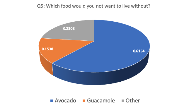
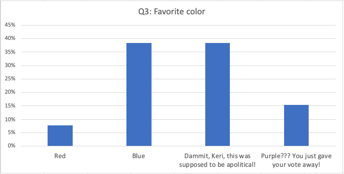
More decimal places is more scientific – and that’s irrefutable! 🙂 Of course the question itself was ridiculous! You can tell more about me and my favorite food from this question, than you can about the respondents. From the fairly large percentage (23.08%!) of “Other” responses, I’m guessing their grasp of avocado primacy is pretty low.
When you do ridiculous things in a survey, like ask dumb questions (you know, for fun! Like the Hudsucker Proxy) or don’t offer a good range of answers, you usually get more “Other” responses – because respondents can’t find the right place for their answer to go. Here’s an example:
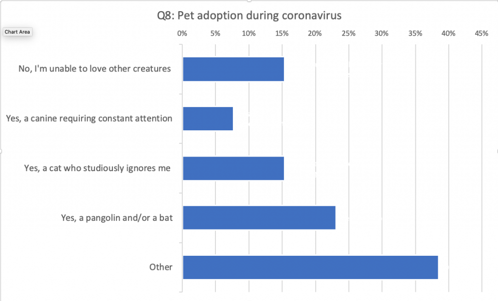
“Other” write-ins here included people saying they already had pets, or that they damn well could love other creatures, or that they were breeding mosquitoes. (Who is this person and how are they my friend?)


I saw a study in Time magazine. In little letters at the bottom, I saw the words: “The results of this poll are not scientific.” So why do they print it?!? Well, it’s a little better than no disclaimer at all, which is what we often get. But it’s good to keep in mind – media outlets and others like to have data to back up their articles, and not all of those data are created equal.
As we’ve learned in the last four difficult years, stats are as political as any other activity or content. They have always been. They’re neither “objective” nor perfect by virtue of being numeric. We find truth in qualitative, impressionistic, anecdotal, or “subjective” data, we find it in numbers, and we find it in life.

But it’s the truth, even if it didn’t happen.
Chief Broom, One Flew Over the Cuckoo’s Nest by Ken Kesey
Why should my opinion on stats matter?
I’m not a stats queen – but I’m certainly stats-queen adjacent. I’ve used or witnessed most of the main techniques used with survey data, and many advanced ones, over the past twenty years. I’ve interpreted data and reported to government and other clients, and I’ve been on teams with lots of other interpreters. I’ve defended my interpretations with clients and interested parties – successfully. In part this is because normal people are often a bit dazzled by stats-speak and if you don’t stumble when you speak, they trust someone who sounds like they know.
But it’s also because I check my work with others. In our current multi-level crises, we’ve seen a lot of “unchecked” data hit the streets on the coronavirus and its potential cures, treatments and vaccines. You’ve all heard about peer-review and “pre-review” studies that later come to be questioned. I myself eat up these articles! I’m so eager to have a solution, so life can return to normal, I read them with excitement and a willing suspension of disbelief.
But there’s less truth there than in Chief Broom’s fictional account of Nurse Ratched. It’s not just that someone may have made a mathematical error. That’s always possible, but it’s easily found and corrected. It’s more that you interpret it to suit your needs. We all want this disease to be curtailed, or the current president to be beaten like the dawg that he is (apologies to “dogs,” which are not the same). When you’ve got an opinion, even if you try not to, you’re susceptible to bias. And when you rush – like, say, getting a paper into the public’s hands or a vaccine into their arms during a pandemic – that crucial time to check your work with others is shortened, and errors of interpretation can be more serious.
Why is this important?
It’s important to think about this stuff because data are the machine behind a lot of our modern functions (not to speak of our dysfunctions). 2020 Census data. Mail voter data fraud accusations. Vaccine effectiveness, and more transmissible COVID-19 mutations. The Orange Menace and his evil minions promote unproven answers to some of the most important questions of the day. But you can be a good data interpreter if you start from a nice blend of curiosity and skepticism. It is not a bad start to look to bunches of interpreters – rather than to lone wolves like internet randos promoting something you’ve never heard of (conspiracy theories, untested remedies/preventives, polemics).
Think of some of the bureaucracies that are important these days. There’s the National Institutes of Health, the Census Bureau of the Commerce Department, and the diffuse but aligned state elections boards. There’s beauty in bureaucracy because decisions are depersonalized. They’re slower because there is a bunch of wonky nerdy numbers people correcting each other before data reach the public, and administrators who have to sign off on things. So, not perfect, but also not Deep State monsters.
* Footnote
It is unbelievable but true – 334 people have signed up to receive my blog by email. I only ever see a handful in the site stats – literally between 5 and 12 people per blog post. So I thought that’s how many were watching. But late this year I upgraded my website and my website guru, Barb Drozdowich from Vancouver, BC, said I actually have 334 people on the rolls! They may read the email in their email inbox, rather than visit the site – I do that on blogs I’ve signed up for too.
I have felt a bit woozy about posting ever since. But the number doesn’t mean that many people read my blog each time I post. It did, however, make me want to do a survey! If I could get 334 responses, well, heck! That’d be a pretty amazing turnout!
You May Also Like

Spin the globe: Bogota
20 March, 2024

Oops in a remote corner of M ...
22 January, 2024

Back to the beginning
15 September, 2023
Leave a Comment